
Michael Beirut is a genius. Not only because of of his incredible career in design but also because of his skill of writing about design in a way that is clever, engaging, and thought-provoking. My goal is that 30 years from now I can accomplish a fraction of what he has.

Image Credit: Jake Chessum/School of Visual Arts
This article is about his brilliant article from Design Observer written in 2007 (recently republished on itsnicethat.com in honor of the new book, 'Now You See It and Other Essays on Design'). I'm basically just gonna quote my favorite parts, provide some dope images of my favorite Beirut type in action, and that's pretty much it. I would encourage everyone to read the full thing because it's fantastic.

MIT Media Lab business cards
Image Credit: It's Nice That
1. Because it works.
Some typefaces are just perfect for certain things. I’ve specified exotic fonts for identity programs that work beautifully in headlines and even in text, but sooner or later you have to set that really tiny type at the bottom of the business reply card. This is what Franklin Gothic is for.

Saks Fifth Avenue Redbranding, 2007
Image Credit: designboom.com
5. Because it was there.
“We use Baskerville and Univers 65 on all our materials, but feel free to make an alternate suggestion.” Really? Why bother? It’s like one of those shows where the amateur chef is given a turnip, a bag of flour, a leg of lamb, and some maple syrup and told to make a dish out of it.

10. Because it’s boring.
Tibor Kalman was fascinated with boring typefaces. “No, this one is too clever, this one is too interesting,” he kept saying when showed him the fonts I was proposing for his monograph. Anything but a boring typeface, he felt, got in the way of the ideas. We settled on Trade Gothic.

Poster Inner City Infill, 1985. The New York State Council for the Arts, USA. Via Cooper Hewitt
13. Because you can’t not.
When I published my first book of essays, I wanted it to feel like a real book for readers — it had no pictures — so I asked Abbott to design it. He suggested we set each one of the seventy-nine pieces in a different typeface. I loved this idea, but wasn’t sure how far he’d want to go with it. “What about the one called ‘I Hate ITC Garamond?’” I asked him. “Would we set it in ITC Garamond?” He looked at me as if I was crazy. “Of course,” he said. The book is beautiful, by the way, and not the least bit slutty.
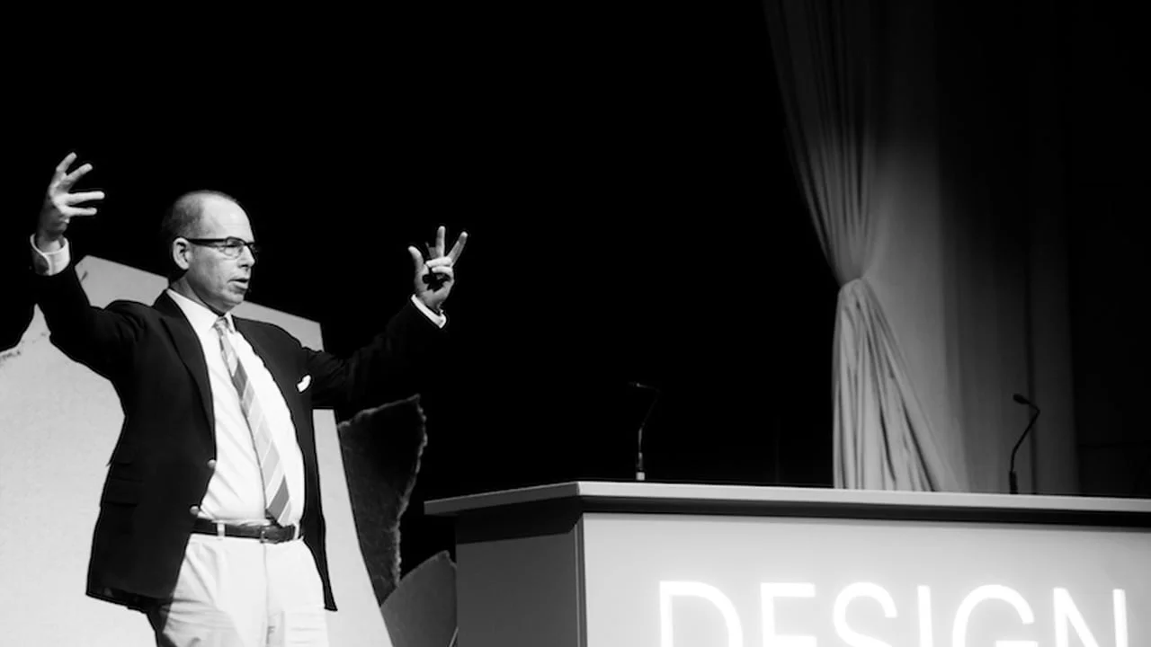
Image Credit: Vimeo
Those were some of my favorite nuggets of wisdom from that article, and I really look forward to snagging the new book and immersing myself in Michael's wisdom.
Cheers to you Michael Beirut for being an an amazing designer, even better communicator, and an inspiration for designers like me everywhere!

Image Credit: AIGA