Erik Spiekermann by Zan Barnett

HigherEd-Spikermann-Hero.jpg

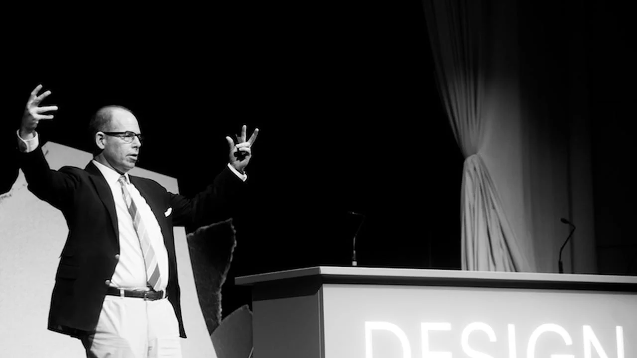
Most designers (hopefully) are familiar with the brilliant work of Erik Spiekermann, the mind behind MetaDesign and FontShop. Over his incredible career he has been responsible for some of the most comprehensive corporate design systems in Germany (including work for Audi, Volkswagen and Heidelberg Printing) and was among the first to see brand identity as more than just a mark.

I learned that a brand isn’t a logo. There has to be implementation. You can design anything, but if the rubber doesn’t hit the road, you’ll be remembered as a great strategist but the client won’t call you again. You have to have a strategy, and you also have to be able to visualize it – one doesn’t go without the other. So I wasn’t a graphic designer anymore. I was a corporate designer, which is quite different.

This article is a short response to an amazing interview I read with Spiekermann at 99U.

Image Credit: 99U

Image Credit: 99U

While his work speaks for itself, the words that Erik actually speaks are on another level of enlightened. It may be his years in the game, or general European wisdom, but pretty much everything he says should be soaked up and locked into every designers brain-vault.

Below are some of my favorite nuggets that I think are worth checking out. 

On mothers and feedback:

We talk in pixels but still my concern is always: What does it look like when it arrives in people’s hands? What does it look like in my mother’s hands? Everybody’s mother is the average consumer. My mother is dead, but she always gave me my best feedback. Mothers are good because they kind of know us personally, but they don’t professionally. So they are well-meaning observers. And because they’re our mothers, we listen to them.
Image Credit: fontfont.com

Image Credit: fontfont.com

On inspiration:

But more than envy, there’s appreciation. All these people have attitude. And I like people with attitude – that is probably the common denominator here.

On aging:

Well, I’m 70, which is fucking old. The advantage of being older is that you have no fear. You go into a new project and think, Look, I’ve done something like this before. I’ve cracked this one. We redesigned the visual identity for the Berlin Transport Authority after the Berlin Wall came down – chaos. We redesigned the Düsseldorf airport signage within four weeks after a fire. Every time you get a project, you think, “My god, how do I start?” The start is the most important part, and that’s where confidence comes in. When you’re older you have the confidence.

On the possibility of retirement:

Of course not. I need to live to be a hundred years old to do half of my plans. Some of them go 50 years  back. Like I want do a monograph on Louis Oppenheim, a German type designer, obviously Jewish, who died in ’35, luckily, before the Nazis could get to him. I’ve always liked his work. He’s up there with the greats and nobody knows it. 
Image Credit: freundevonfreunden.com

Image Credit: freundevonfreunden.com

Free Wisdom: Michael Beirut by Zan Barnett

HigherEd-Beirut-Hero.jpg

Michael Beirut is a genius. Not only because of of his incredible career in design but also because of his skill of writing about design in a way that is clever, engaging, and thought-provoking. My goal is that 30 years from now I can accomplish a fraction of what he has. 

Image Credit: Jake Chessum/School of Visual Arts

Image Credit: Jake Chessum/School of Visual Arts

This article is about his brilliant article from Design Observer written in 2007 (recently republished on itsnicethat.com in honor of the new book, 'Now You See It and Other Essays on Design'). I'm basically just gonna quote my favorite parts, provide some dope images of my favorite Beirut type in action, and that's pretty much it. I would encourage everyone to read the full thing because it's fantastic.

MIT Media Lab business cardsImage Credit: It's Nice That

MIT Media Lab business cards
Image Credit: It's Nice That

1. Because it works.
Some typefaces are just perfect for certain things. I’ve specified exotic fonts for identity programs that work beautifully in headlines and even in text, but sooner or later you have to set that really tiny type at the bottom of the business reply card. This is what Franklin Gothic is for. 
Saks Fifth Avenue Redbranding, 2007Image Credit: designboom.com

Saks Fifth Avenue Redbranding, 2007
Image Credit: designboom.com

5. Because it was there.
“We use Baskerville and Univers 65 on all our materials, but feel free to make an alternate suggestion.” Really? Why bother? It’s like one of those shows where the amateur chef is given a turnip, a bag of flour, a leg of lamb, and some maple syrup and told to make a dish out of it.
HigherEd-Beirut-5.jpg
10. Because it’s boring.
Tibor Kalman was fascinated with boring typefaces. “No, this one is too clever, this one is too interesting,” he kept saying when showed him the fonts I was proposing for his monograph. Anything but a boring typeface, he felt, got in the way of the ideas. We settled on Trade Gothic.
Poster Inner City Infill, 1985. The New York State Council for the Arts, USA. Via Cooper Hewitt

Poster Inner City Infill, 1985. The New York State Council for the Arts, USA. Via Cooper Hewitt

13. Because you can’t not.
When I published my first book of essays, I wanted it to feel like a real book for readers — it had no pictures — so I asked Abbott to design it. He suggested we set each one of the seventy-nine pieces in a different typeface. I loved this idea, but wasn’t sure how far he’d want to go with it. “What about the one called ‘I Hate ITC Garamond?’” I asked him. “Would we set it in ITC Garamond?” He looked at me as if I was crazy. “Of course,” he said. The book is beautiful, by the way, and not the least bit slutty.
Image Credit: Vimeo

Image Credit: Vimeo

Those were some of my favorite nuggets of wisdom from that article, and I really look forward to snagging the new book and immersing myself in Michael's wisdom. 

Cheers to you Michael Beirut for being an an amazing designer, even better communicator, and an inspiration for designers like me everywhere!


Image Credit: AIGA

Image Credit: AIGA

Fuckin' Awesome: Abram Games by Zan Barnett

HigherEd-Games-0Hero.jpg

So I probably should have know about this guy ages ago, but just learned about the genius of Abram Games after reading David Airey's article about his posters and design career. 

Abram Games' work can be summed up pretty simply: 'Abram Games was one of the 20th century’s great graphic designers, and the only person in army history to be given the title of Official War Poster Artist.'

www.abramgames.com

www.abramgames.com

Games was born in 1914 and spent his entire life working in London (this next part I'm ripping directly from Wikipedia but it's a pretty good summary): Because of the length of his career – over six decades – his work is essentially a record of the era's social history. Some of Britain's most iconic images include those by Games. An example is the "Join the ATS" poster of 1941, nicknamed the "blonde bombshell" recruitment poster. His work is recognised for its "striking colour, bold graphic ideas, and beautifully integrated typography"

www.abramgames.com

www.abramgames.com

www.abramgames.com

www.abramgames.com

Abram Games was an incredibly prolific designer and his style is recognizable and extends beyond his amazing poster work into stamps, book covers, and even product design, creating the Cona Coffee percolator in 1962. That's pretty much all the meaningful thoughts I have to contribute on this badass, but there's a TON of great information out there in you want to read further. 

AND even better: almost every poster Games created in his 60+ year career is available to purchase HERE.

Check out some of my favorite posters and work below.

www.abramgames.com

www.abramgames.com

www.abramgames.com

www.abramgames.com

www.abramgames.com

www.abramgames.com

www.abramgames.com

www.abramgames.com

www.abramgames.com

www.abramgames.com

www.abramgames.com

www.abramgames.com

Dope and Timeless: Benjamin Sherbow by Zan Barnett

HigherEd-Sherbow-Hero.jpg

Today I was reading an awesome essay by Steven Heller called 'Earnest Elmo Calkins: Founder of Modern Advertising and a Designer You Probably Don’t Know'. The article was super interesting and a fascinating look into the early concepts that form modern advertising as we know it but the section that really get me hyped was learning about Benjamin Sherbow. 

HigherEd-Sherbow-1.jpg

Benjamin Sherbow, although not well known, was instrumental in establishing standards for type and layout in advertising (I guess you could just call it Graphic Design), and I can't believe I'm only just learning his name. Doing a little more research led me to another article by Steven Heller (who is brilliant and has seemingly boundless design knowledge) on Sherbow; he sums up Sherbow's contribution much better than I can:

"In 1922, Benjamin Sherbow, a “consultant in Typography” and the author of Making Type Work and Sherbow’s Type Charts, self-published Effective Type-use for Advertising. This was six years before W.A. Dwiggins’s Layout in Advertising and Jan Tschichold’s Die Neue Typographie, the two leading books on type use. Sherbow’s book is credited by “designers,” art directors, and type directors of the era for being a no-nonsense guide through the rights and wrongs of typographic text and display."

HigherEd-Sherbow-2.png
HigherEd-Sherbow-3.png

Basically Benjamin Sherbow identified the best practices in advertising typography before 'best practices' were even a thing in 1916. He literally spelled it out in black and white (was color printing invented then?) and is an unsung (well medium-sung) hero of print advertising. The thing I thought was especially awesome is how digestible Sherbow made things by using simple language and examples. 

Below is an awesome excerpt that illustrates what Sherbow's writings are all about:

The man who drives his cart through your street and yells “Strawberries! Strawberries!” does perfect advertising.
He gets the attention of potential buyers and tells them, understandably, good news of something to buy and he has the goods right there when and where desire is aroused: all this is merchandising at its best.
Advertising at its best is any means whereby large numbers of people can be told good news about something to buy. Advertising is simply a wholesale method of human communication.
Advertising typography is just ordinary common sense typography applied to advertising.
It is not something wildly and fiercely unique.
In fact, the general notion that advertising itself is a separate, special, peculiar, deeply mysterious thing is a vicious idea. That attitude toward advertising is what makes so many advertising efforts, both in conception and execution, pretty poor specimens
The best and wisest advertising men of my acquaintance strive with all their might for naturalness. They seek natural points of appeal, natural language in advertising, natural illustrations, natural comparisons and the atmosphere of every day life in all they do. . .
So type must be the clear, efficient conveyor of the advertising message. It must be simple and natural, no frills, no self consciousness, no “showing off” – just doing its duty.
In a nutshell, what is good advertising typography? It is typography that is supremely easy to read.


Benjamin Sherbow is the original legibility genius and for that I am grateful!

And...
If you actually read down this far, the best news of this whole blog is that BOTH of these awesome type books are available for free download online. 

Highly recommend grabbing them for reference:

Making Type Work
Effective Type Use For Advertising

Check it out and learn!

Ball Is Life: Max Amato by Zan Barnett

Amato-HigherEd-Hero.jpg

This is just a mini feature about my homie Max

Instagram @tomatoamato

Instagram @tomatoamato

Max and I went to school together at Temple, he has an amazing eye for design and I always thought he absolutely murdered it. He's now working with the genius minds at Doubleday & Cartwright in Brooklyn but that's not why I'm writing this.

I need to write this because Max makes the dopest little basketball illustrations that I've ever seen (mostly on Instagram but they're so sick that they deserve a page on his website). 

Game 4Instagram @tomatoamato

Game 4
Instagram @tomatoamato

Max's illustrations are always outta control and remind me of an even more brilliant take on one of my favorite campaigns of all time. Adam Silver needs to hire this man. 

Check out some of his work below and give him a follow!


AD(D)Instagram @tomatoamato

AD(D)
Instagram @tomatoamato

A day late, but congrats to Russell Westbrook for the MVP winInstagram @tomatoamato

A day late, but congrats to Russell Westbrook for the MVP win
Instagram @tomatoamato

Happy birthday KD aka #durantula.Instagram @tomatoamato

Happy birthday KD aka #durantula.
Instagram @tomatoamato

Can basketball season plz start already im bored #ballislifeInstagram: @tomatoamato

Can basketball season plz start already im bored #ballislife
Instagram: @tomatoamato

Russ time!!!Instagram: @tomatoamato 

Russ time!!!
Instagram: @tomatoamato


The playoff dance.Instagram: @tomatoamato

The playoff dance.
Instagram: @tomatoamato

Insta-Damnnn: Guido de Boer by Zan Barnett

171101_Guido-Hero.jpg

Here's another mini-blog I've been brainstorming: Instagram accounts I think are tight and want to share and lead me to more work and inspiration. 

First one is an easy decision: Guido de Boer

Image Credit: Instagram @guidodeboer

Image Credit: Instagram @guidodeboer

I don't know a ton about Giudo but after a bit of research I can report that he:

Is European (from the Netherlands I think) and therefore is brilliant (one day I will actually write an article about that). 
Does beautiful things with letterforms.

Image Credit: Instagram @guidodeboer

Image Credit: Instagram @guidodeboer

Image Credit: Instagram @guidodeboer

Image Credit: Instagram @guidodeboer

That's about it, but that's all I need for now. There is a good mini-interview here as well.
(Guido! Hit me up if you ever read this because I want to pick your brain!)

Scope and follow!

Image Credit: Instagram @guidodeboer

Image Credit: Instagram @guidodeboer

Image Credit: Instagram @guidodeboer

Image Credit: Instagram @guidodeboer

Image Credit: Instagram @guidodeboer

Image Credit: Instagram @guidodeboer

Image Credit: Instagram @guidodeboer

Image Credit: Instagram @guidodeboer

Dope-Ass Agency: Snask by Zan Barnett

ZanBarnett_SnaskHero.jpg


This is the first of an (I’m sure to be) recurring series of posts about agencies I think are doing amazing shit, and projects I find mind-blowing.

I have a list of agencies I’ll be starting with, (most are European, but that’s a different article completely…) the only prerequisite is that I find their work unexpected and exceptional.

And with that intro-blurb; the first Agency I want to highlight is Snask.


Photo Credit: Cowboyzoom.com

Photo Credit: Cowboyzoom.com


“Snask means candy in old Swedish, but it also means filth and gossip, which we find brilliant. Basically, from 0-12 years old, you’ll do anything for candy, and from 12-70 you’ll do anything for filth.”

Snask is fucking AWESOME.

Maybe it’s the European thing (Fredrik and Magnus?? DOPE-ass names. Again; a different topic for a different article), maybe it’s the fact that they have branched beyond typical agency capabilities with books, beer, and a record label, maybe it’s because this is their studio portrait, but something about Snask’s whole vibe just kicks a lot of ass.

The Snask manifesto is concise and irreverent and gives a sweet little glimpse into the minds at the agency:

01/ If you don’t like your job – quit.
02/ If you love someone – let it show.
03/ Generosity always pays itself back.
04/ Always achieve greatness yourself before pointing out the faults and mistakes of others.
05/ Bureaucracy is spelled Bureaucrazy.
06/ Talk with clients like you talk to your family, friends and pets.
07/ Social skills are as important as being good at setting type or knowing how to spell.
08/ See people as people, not as target groups.
09/ Just because you wear a black suit, doesn’t mean you’re a goddamn professional.
10/ Having enemies is a good thing. It proves that you stood up for something sometime in your life.

Check out the rest of the About section, all of it is super-well done, there is not a lot of information about the people themselves, but luckily, AIGA has a great interview here where you can learn more about this badass group of individuals.

Now let’s talk about Shower Beer.

Photo Credit: Snask

Photo Credit: Snask

For the last 8 years or so I have been under the impression that a regular beer can become a shower beer depending on proximity to the shower, and I am a HUGE fan of shower beers.

(If you have never enjoyed the experience, I HIGHLY recommend it).

But Snask has proved me wrong with their hilarious and brilliant new self-initiated project: Shower Beer. The Shower Beer is simple: A tiny 18 centiliter, (3/4 cup for us on the other side of the pond) beer, brewed by PangPang brewery meant to be enjoyed in the shower.

Maybe I’m a little simple, but everything about this project is fuckin’ brilliant.

First: that serif is beautiful. I’m 99% sure it’s Value Sans from Colophon. (I notice their website uses Apercu, another Colophon face). When your lowercase E looks like that one does, you don’t need to add shit. No monoweight line illustrations, no floods of color, no Brothers thank God (don’t get me wrong, it’s nice, but played to DEATH. You heard it here like tenth: RIP Brothers). Nice typesetting goes SO far for me. You could just throw one lowercase E on that bottle and I’d probably love it.

Second: I am a SUCKER for concept (there will be more on that in another article) and the idea of having a mini beer for a shower is funny, clever, and just smart as hell.

When you add in the little pink cap (which Tom Swinnen on Brand New brilliantly pointed out becomes a shower cap for the bottle) and the suds as a graphic element, you get a project that uses a minimal amount of elements to create a beautiful solution. Pretty much all their projects are equally crispy. 

So cheers to you Snask, you guys fuckin’ kill it!

Now if only I could get a case here in Denver…

An Introduction to my Brain by Zan Barnett

ZanBarnett-IntroImage.jpg

Hey friends!

Here’s the scoop about this blog:

My name is Zan Barnett. I’m a 27-year-old graphic designer and I really like to think and talk about design (with other thoughts mixed in). I grew up in beautiful Utah and graduated from the Tyler School of Art with a Master’s Degree in Design last year, but now that I am out of school, I don’t have a ton of homies in my immediate circle that I can share my thoughts about Eddie Opara and ball-serifs with. So my goal is to just throw them out to the world and hopefully create awesome conversations with people that want to catch them.

Hopefully I’ll get to shit like:

Why I think European design is brilliant,
Why arbitrarily rounding the edges of letterforms is not chill,
Agencies that are kicking ass,
Helvetica (one way or another),
Why I love Armin Vit,
Dope things I found this week,
Optical vs. mathematical kerning,
Are sports monograms tight?

That’s a quick stream of consciousness but I think it’s a good place to start. I also read a ton of articles and interviews that I am blown away by and want to share (maybe with a few thoughts tacked on) and I am excited to get rolling with this platform to connect to other designers, creatives, and genuinely inspired people.

I like to write, but I’m not great at it. So starting with this very post, on this very blog (written on October 4, 2017, posted who-knows-when) I will be sharing the occasional ridiculous, hopefully insightful thoughts I have about design, letterforms, and really anything that hits me in the heartstrings one way or another.

This is the shit I think is cool, hopefully you will think some of it is too.